The XIX Legislature is the first to operate under the new constitutional rules approved in the 2020 referendum, which cut the Chamber of Deputies from 630 to 400. Now each vote matters more, and each seat is harder to win, so we think the bar for getting elected should be higher.
First we must understand who they are. Are we looking at the same pool of career politicians who have cycled through Italian institutions for decades, or did the smaller chamber attract representative with diverse background? Who really are these deputies, and how do they compare to what we might expect from a representative assembly?
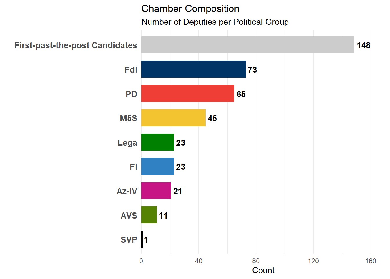
3.1.1 The Numbers of Power
The snap elections of September 25, 2022 produced a clear result that Italy has not seen in a while: the Center-Right bloc won a comfortable majority, largely thanks to the rise of Fratelli d’Italia (FdI), which went from being a minor party to the largest one in Parliament in a short time.
This outcome was strenghtened by the “Rosatellum” electoral law: out of 400 seats, 148 deputies were elected via the uninominal colleges (First Past the Post method). The governing coalition, composed of Fratelli d’Italia, Lega and Forza Italia (FI), dominated this contest, sweeping 123 of the 148 single-member districts. These candidates were supported by the entire coalition, and are often grouped by their broader bloc, while the remaining were assigned via proportional plurinominal lists.
But does the electoral victory actually translate into control of the Chamber? The numbers suggest Yes.
Code
df_deputati_final |># 1. Count the number of deputies for each partycount(party_acronym, sort =TRUE) |># 2. Initialize the plotggplot(aes(x =reorder(party_acronym, n), y = n, fill = party_acronym)) +# 3. Create the barsgeom_col(width =0.7) +# 4. Add the exact count labels next to the barsgeom_text(aes(label = n), hjust =-0.2, fontface ="bold") +# 5. Flip coordinates to make horizontal bars (better for reading names)coord_flip() +# 6. Apply the custom color palette defined earlierscale_fill_manual(values = party_colors) +# 7. Add extra space on the right (top when flipped) for the labelsscale_y_continuous(expand =expansion(mult =c(0, 0.15))) +# 8. Clean theme adjustmentstheme_minimal() +theme(legend.position ="none",panel.grid.major.y =element_blank(),axis.text.y =element_text(size =11, face ="bold") ) +# 9. Final Titles and Labelslabs(title ="Chamber Composition",subtitle ="Number of Deputies per Political Group",x ="",y ="Count" )
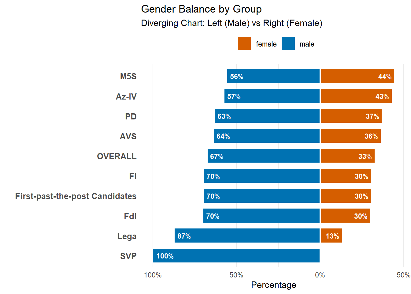
3.1.2 Gender Balance: the Meloni Paradox
There’s a tension in Italian politics right now when it comes to gender representation. The country’s first female Prime Minister came from the Right, not the Left: Giorgia Meloni broke through a “Glass ceiling” for females in the political world that many progressive parties have tried for decades but didn’t succeed.
Is this a true paradox? The data below provides a answer: No.
While the Right produced the national figurehead, Left and Center-Left parties elect and maintain a significantly higher percentage of women. Meloni may be the most visible woman in Italian politics, but her own coalition is still predominantly male.
Code
# 1. Prepare Data with Overall Benchmarkdf_demographics_full <- df_deputati_final |>left_join(df_deputati |>select(id_numerico, gender, description), by ="id_numerico")# 2. Create Plot Dataset (Parties + Overall)df_gender_plot <-bind_rows( df_demographics_full |>select(party_acronym, gender), df_demographics_full |>mutate(party_acronym ="OVERALL") |>select(party_acronym, gender)) |>count(party_acronym, gender) |>group_by(party_acronym) |>mutate(pct = n /sum(n)) |>ungroup() |>mutate(plot_pct =ifelse(gender =="male", -pct, pct), label_pct = scales::percent(pct, accuracy =1) )# 3. Sorting Logic# A. Calculate Female % for ALL parties (0% for all-male groups)df_female_pct <- df_gender_plot |>filter(gender =="female") |>select(party_acronym, female_pct = pct)# B. Get list of ALL parties (including those with 0% female)all_parties_list <-unique(df_gender_plot$party_acronym)# C. Join and fill NAs with 0df_sort_base <-tibble(party_acronym = all_parties_list) |>left_join(df_female_pct, by ="party_acronym") |>mutate(female_pct =replace_na(female_pct, 0))# D. Create the final order vector (sort by the calculated female_pct)order_gender <- df_sort_base |>arrange(female_pct) |>pull(party_acronym)# Apply factor orderdf_gender_plot$party_acronym <-factor(df_gender_plot$party_acronym, levels = order_gender)# 4. Plottingggplot(df_gender_plot, aes(x = party_acronym, y = plot_pct, fill = gender)) +geom_col(width =0.7) +geom_text(aes(label = label_pct), hjust =ifelse(df_gender_plot$plot_pct >0, 1.2, -0.2), color ="white", fontface ="bold", size =3) +coord_flip() +scale_y_continuous(labels =function(x) scales::percent(abs(x))) +scale_fill_manual(values =c("female"="#D55E00", "male"="#0072B2")) +geom_hline(yintercept =0, color ="white", linewidth =1) +theme_minimal() +theme(legend.position ="top", panel.grid.major.y =element_blank(),axis.text.y =element_text(face ="bold", size =10) ) +labs(title ="Gender Balance by Group",subtitle ="Diverging Chart: Left (Male) vs Right (Female)",x ="", y ="Percentage", fill ="" )
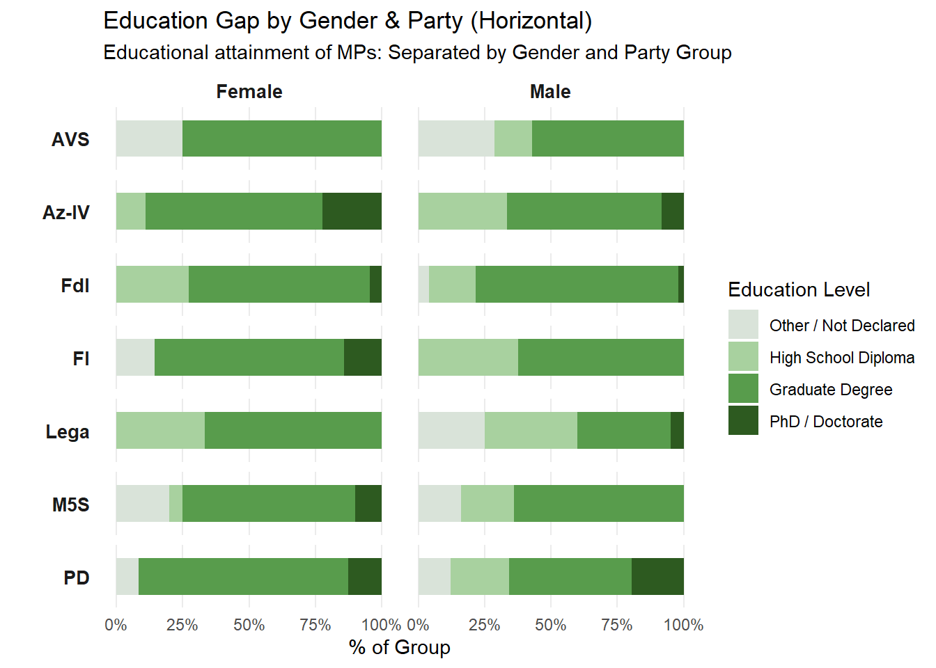
3.1.3 Education Gap: Women Need a Higher Bar to Enter Parliament
While women are underrepresented in Parliament, they tend to be more educated than the men. This suggests that women they need stronger credentials just to be considered viable candidates in the first place.
Code
# 1. DATA PREPARATIONdf_education_gender <- df_deputati_final |>left_join(df_deputati |>select(id_numerico, gender, description), by ="id_numerico") |>filter(party_acronym !="Unknown/Misto") |># --- FILTERING OUT MINOR PARTIES ---filter(!party_acronym %in%c("SVP", "First-past-the-post Candidates")) |>mutate(gender_label =ifelse(gender =="female", "Female", "Male"),# 1. CLASSIFY EDUCATION (HIERARCHICALLY)education_level_raw =case_when(str_detect(description, regex("Dottorato|PhD", ignore_case =TRUE)) ~"PhD / Doctorate",str_detect(description, regex("Laurea|Master|Specialistica|Università", ignore_case =TRUE)) ~"Graduate Degree",str_detect(description, regex("Diploma|Maturità|Liceo|Istituto Tecnico", ignore_case =TRUE)) ~"High School Diploma",TRUE~"Other / Not Declared" ),education_level =factor(education_level_raw, levels =c("Other / Not Declared", "High School Diploma", "Graduate Degree", "PhD / Doctorate")) )# 2. PLOTTING (FACETED GRID - 2 COLONNE)ggplot(df_education_gender, aes(x = party_acronym, fill = education_level)) +geom_bar(position =position_fill(reverse =TRUE), width =0.7) +facet_grid(party_acronym ~ gender_label, scales ="free_y", switch ="y") +coord_flip() +scale_fill_manual(values =c("Other / Not Declared"="#D9E3D9","High School Diploma"="#A8D19F","Graduate Degree"="#589C4C","PhD / Doctorate"="#2D5A20" )) +scale_y_continuous(labels = scales::percent) +theme_minimal() +theme(panel.grid.major.y =element_blank(), panel.grid.minor =element_blank(),strip.placement ="outside", axis.text.y =element_blank(),strip.text.x =element_text(face ="bold", size =10),strip.text.y.left =element_text(face ="bold", size =10, angle =0, hjust =1) ) +labs(title ="Education Gap by Gender & Party (Horizontal)",subtitle ="Educational attainment of MPs: Separated by Gender and Party Group",x ="",y ="% of Group",fill ="Education Level" )
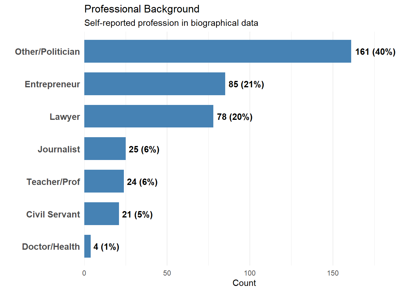
3.1.4 Professional Background: The Rise of Career Politicians
One question worth asking is whether Parliament actually reflects the people it represents in terms of professional experience. Some European parliaments have many former civil servants but Italy’s does not.
The data highlights a dominance of Lawyers and Professional Politicians, often categorized under “Other” since they lack an alternative career. Meanwhile, people who work in healthcare, education, or the private sector are underrepresented.
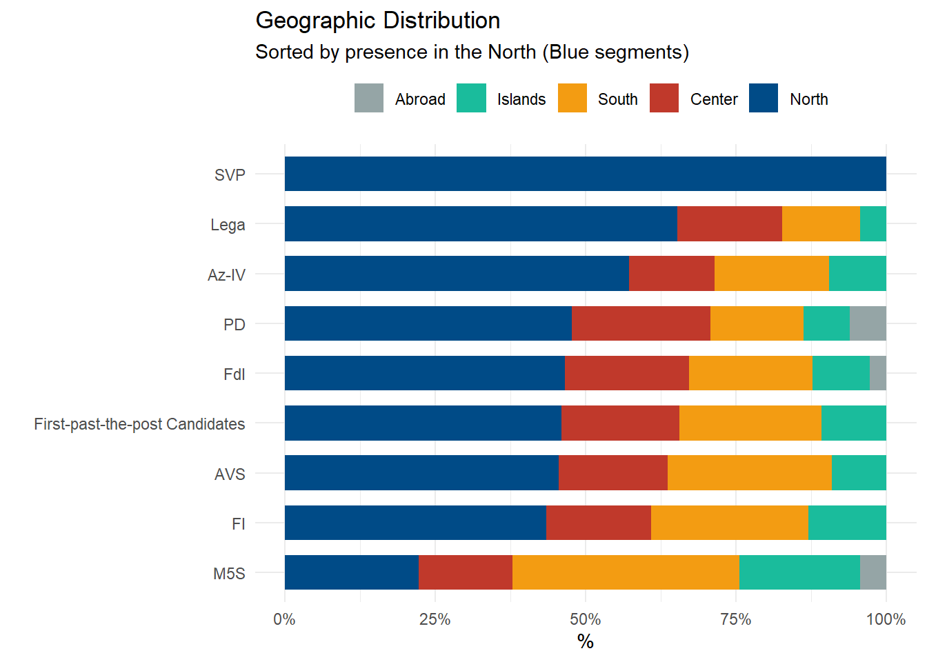
3.1.5 Political Geography: A Nation of Many Italies
In Italy, politics is as regional as the cuisine. The country is like a mosaic of distinct socio-economic identities, and the voting data reflects this distinction.
While Fratelli d’Italia (FdI) is a national “homogenizer”, other forces are deeply based in specific areas:
The North: This is the stronghold of Lega (born as a northern autonomist party) and SVP (representing linguistic minorities in South Tyrol).
The Center-North: The traditional “Red Belt” that represents the Democratic Party (PD).
The South: The Five Star Movement (M5S) dominates here, where people are often discontent because of the economical disadvantages of this region.
Code
# 1. Enrich Data with Geographydf_geo_analysis <- df_deputati_final |>left_join(df_elezioni |>select(id_numerico, coverage), by ="id_numerico") |>filter(!is.na(coverage), party_acronym !="Unknown/Misto") |>mutate(region_raw =str_extract(coverage, "^[A-Z\\s']+") |>str_trim(),macro_area =case_when( region_raw %in%c("PIEMONTE", "VALLE D'AOSTA", "LOMBARDIA", "TRENTINO", "VENETO", "FRIULI", "LIGURIA", "EMILIA") ~"North", region_raw %in%c("TOSCANA", "UMBRIA", "MARCHE", "LAZIO") ~"Center", region_raw %in%c("ABRUZZO", "MOLISE", "CAMPANIA", "PUGLIA", "BASILICATA", "CALABRIA") ~"South", region_raw %in%c("SICILIA", "SARDEGNA") ~"Islands",TRUE~"Abroad"# Fallback ) )# 2. Set Factor Order for Legenddf_geo_analysis$macro_area <-factor(df_geo_analysis$macro_area, levels =c("Abroad", "Islands", "South", "Center", "North"))# 3. Calculate Sorting Ordernorth_order <- df_geo_analysis |>count(party_acronym, macro_area) |>group_by(party_acronym) |>mutate(pct = n/sum(n)) |>filter(macro_area =="North") |>arrange(pct) |>pull(party_acronym)final_order <-c(setdiff(unique(df_geo_analysis$party_acronym), north_order), north_order)df_geo_analysis$party_acronym <-factor(df_geo_analysis$party_acronym, levels = final_order)# 4. Plottingggplot(df_geo_analysis, aes(x = party_acronym, fill = macro_area)) +geom_bar(position ="fill", width =0.7) +coord_flip() +scale_y_continuous(labels = scales::percent) +scale_fill_manual(values =c("North"="#004B87", # Deep Blue"Center"="#C0392B", # Brick Red"South"="#F39C12", # Orange/Gold"Islands"="#1ABC9C", # Turquoise"Abroad"="#95A5A6"# Grey )) +theme_minimal() +theme(legend.position ="top") +labs(title ="Geographic Distribution", subtitle ="Sorted by presence in the North (Blue segments)", x ="", y ="%", fill ="" )
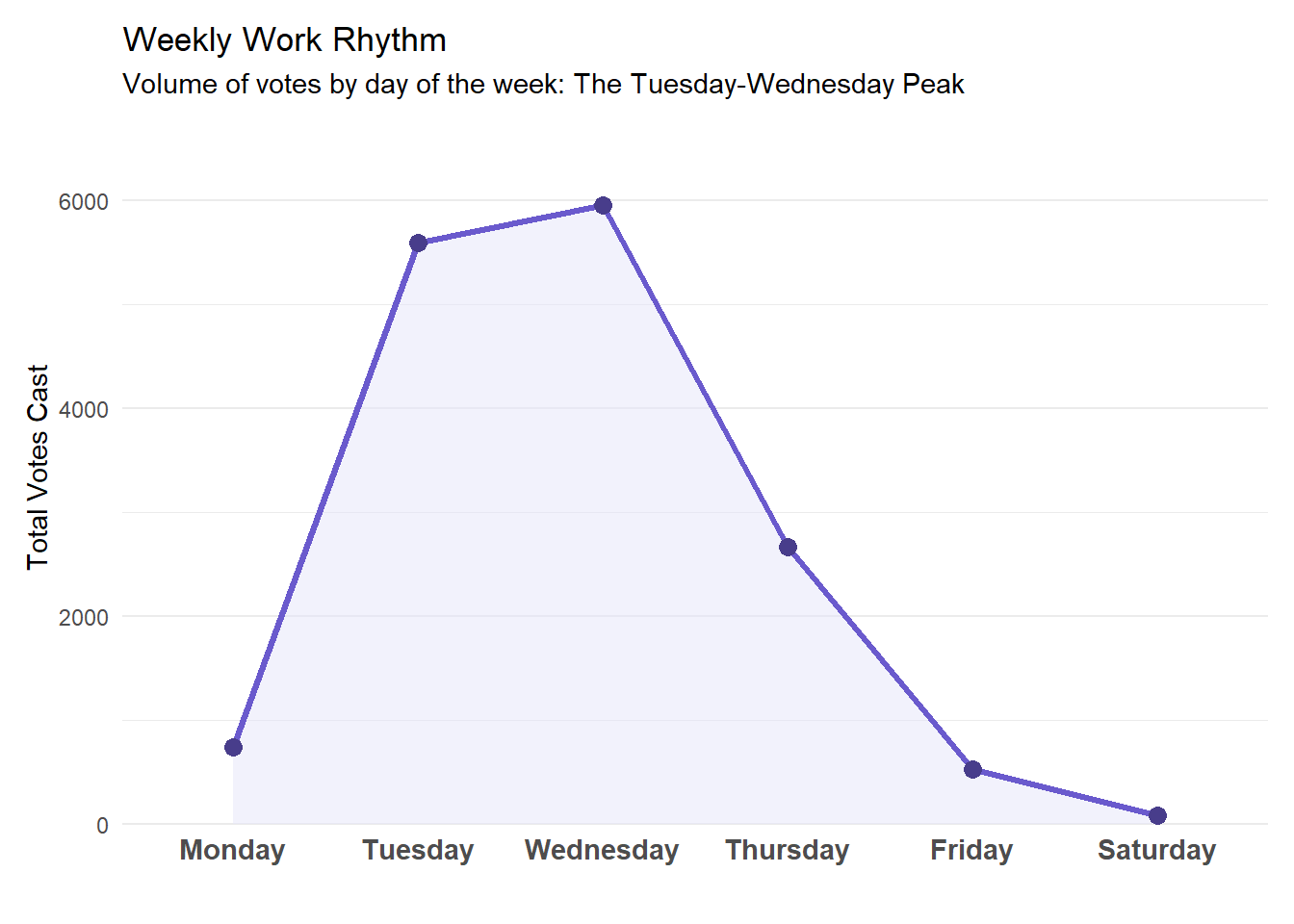
3.2 The “Short Week” Reality
There is a popular joke in Rome: “Parliament opens on Tuesday and closes on Thursday.” The stereotype depicts deputies as commuters who arrive in the capital on Monday night and rush to the airports by Thursday afternoon.
Is this just a myth? The data suggests no.
3.2.1 The Weekly Rhythm
The analysis of voting timestamps confirms the “Short Week” is not a myth. The legislative machine runs at full speed only on Tuesdays and Wednesdays. Mondays and Fridays are phantom days, with low voting activity. The data validates the stereotype: for the average deputy, the parliamentary week effectively lasts 48 to 72 hours.
Code
# 1. Data Preparation: Extracting Time Componentsdf_activity <- df_votazioni |>mutate(date =ymd(date)) |>filter(!is.na(date)) |>mutate(weekday =wday(date, label =TRUE, abbr =FALSE, week_start =1))# 2. Visualization (Styled to match Seasonality Chart)df_activity |>count(weekday) |>ggplot(aes(x = weekday, y = n, group =1)) +geom_area(fill ="#E6E6FA", alpha =0.5) +geom_line(color ="#6A5ACD", size =1.2) +geom_point(color ="#483D8B", size =3) +theme_minimal() +theme(panel.grid.major.x =element_blank(), axis.text.x =element_text(size =11, face ="bold"),plot.margin =margin(t =10, r =10, b =10, l =10) ) +scale_y_continuous(expand =expansion(mult =c(0, 0.15))) +labs(title ="Weekly Work Rhythm", subtitle ="Volume of votes by day of the week: The Tuesday-Wednesday Peak", x ="", y ="Total Votes Cast" )
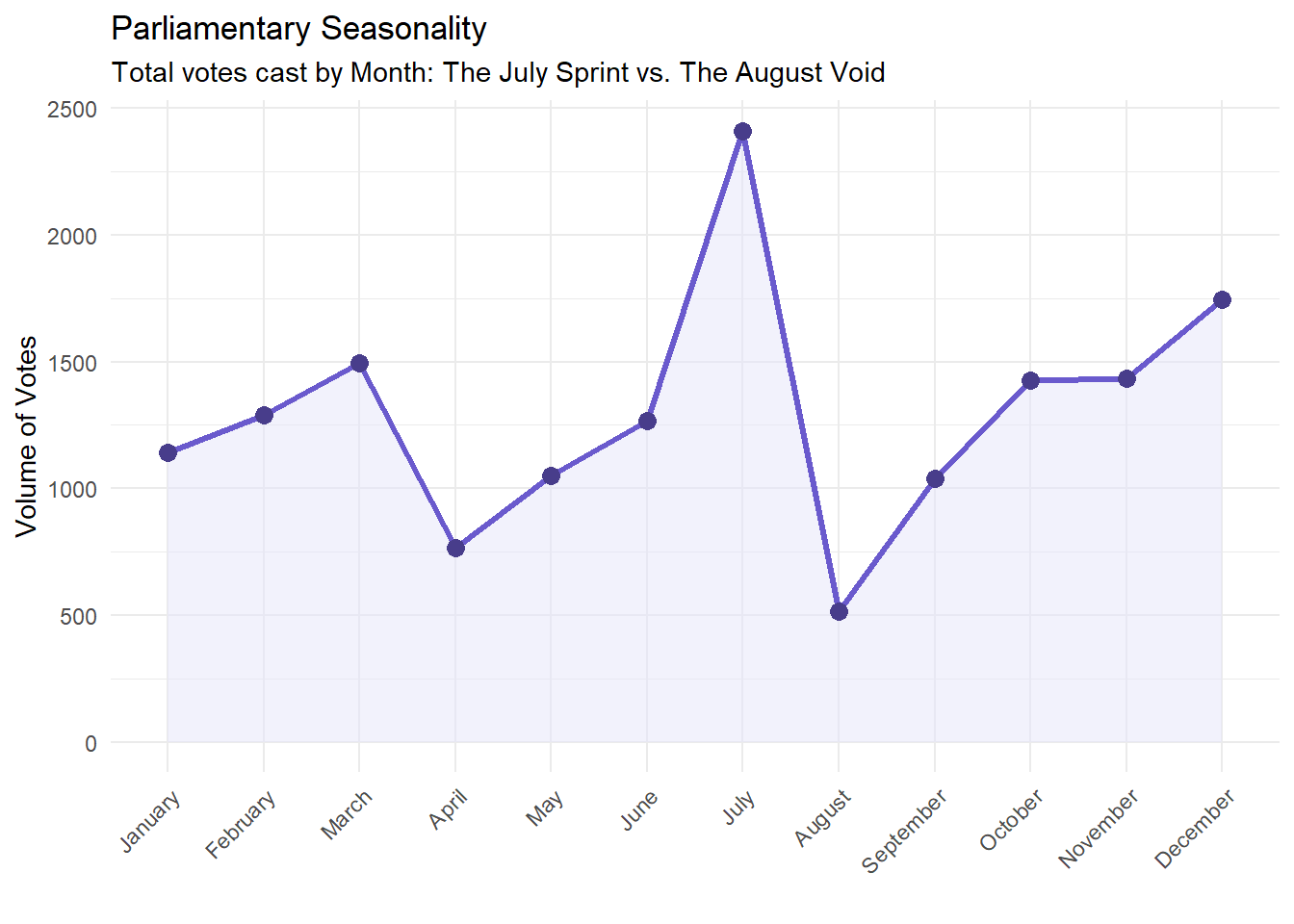
3.2.2 Summer Vacation
Similarly, parliamentary activity is strictly dictated by the calendar of holidays.
August is a vacation month. The Chamber shuts down for summer vacation and voting activity drops drastically. But the month before that, in July, there’s a noticeable spike as deputies rush to do as much as possible before the break. You see a similar pattern around Easter in April, with a smaller peak in March as work ramps up beforehand.
Another pattern is observed in December, which is intense in workload because of the annual Budget Law deadline.
The result is a legislature that operates in bursts: long stretches of low activity followed by frantic voting as a deadline or a holiday approaches.
Code
# 1. Data Preparationdf_votazioni |>mutate(date =ymd(date)) |>filter(!is.na(date)) |>mutate(month_label =month(date, label =TRUE, abbr =FALSE)) |># 2. Aggregationcount(month_label) |># 3. Visualizationggplot(aes(x = month_label, y = n, group =1)) +geom_area(fill ="#E6E6FA", alpha =0.5) +geom_line(color ="#6A5ACD", size =1.2) +geom_point(color ="#483D8B", size =3) +theme_minimal() +theme(axis.text.x =element_text(angle =45, hjust =1) ) +labs(title ="Parliamentary Seasonality", subtitle ="Total votes cast by Month: The July Sprint vs. The August Void", x ="", y ="Volume of Votes" )
4 The Geometry of Consensus
Coalition partners are supposed to vote together, and the opposition is supposed to oppose. But how clean is the reality? Do parties actually vote as blocs, or is there more crossover than the political rhetoric suggests?
We wanted to see who breaks ranks, and when. Is Parliament as polarized as it looks on TV, or is there cooperation happening?
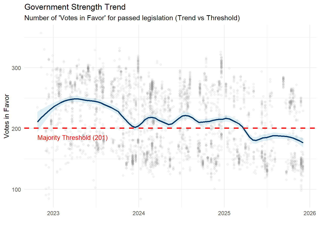
4.0.1 The Stability Test
Does the majority on paper translate into actual voting power? To check whether the Center-Right coalition can pass legislation, we tracked approved motions over time, looking specifically at votes where the government got the outcome it wanted.
The results are fairly stable. There’s a slight decline over time, which is expected as government loses slight momentum after the initial period. Notably, the curve eventually dips slightly below the absolute majority threshold (201 seats).
However, this should not be mistaken for a crisis. In the daily reality of the Chamber, absenteeism lowers the bar: the Government does not always need 201 votes to pass ordinary legislation; it simply needs to outnumber the opposition present in the room.
Code
df_votazioni |>mutate(date =ymd(date)) |>filter(!is.na(date), votanti >100) |>filter(favorevoli > contrari) |>ggplot(aes(x = date, y = favorevoli)) +geom_point(alpha =0.1, color ="grey60") +geom_smooth(method ="loess", color ="#003366", fill ="#ADD8E6", span =0.3) +geom_hline(yintercept =201, linetype ="dashed", color ="red", size =1) +annotate("text", x =min(ymd(df_votazioni$date), na.rm=TRUE), y =190, label ="Majority Threshold (201)", color ="red", hjust =0, vjust =1, size =3.5) +theme_minimal() +labs(title ="Government Strength Trend", subtitle ="Number of 'Votes in Favor' for passed legislation (Trend vs Threshold)", x ="", y ="Votes in Favor" )
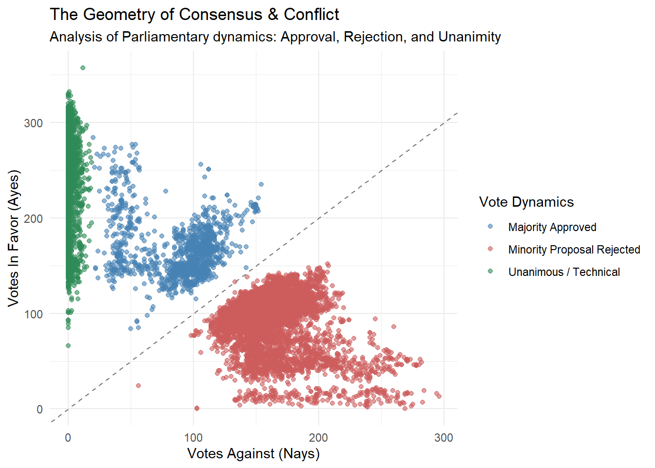
4.0.2 Polarization vs. Consensus
While talk shows suggest perpetual chaos, the data reveals a strict order. Legislative activity is far from random and follows a precise Geometry of Power. The data clusters into three logical zones:
The Green: A large number of votes pass with almost no opposition. These are mostly technical or routine matters where there’s no real political disagreement.
The Blue: The Government passes its laws but the opposition fights (voting against them), but the majority numbers still holds.
The Red:This area is “Nays”, which represents Minority proposals rejected by the Majority. It is where conflict happens to block opposition amendments.
Code
# 1. Data Classificationdf_vote_analysis <- df_votazioni |>filter(votanti >50) |>mutate(outcome =case_when( contrari <20~"Unanimous / Technical",# Case B: Majority Approved (Govt Wins) favorevoli > contrari ~"Majority Approved",# Case C: Minority Rejected (Govt Blocks)TRUE~"Minority Proposal Rejected" ) )# 2. Visualizationggplot(df_vote_analysis, aes(x = contrari, y = favorevoli, color = outcome)) +geom_point(alpha =0.6) +geom_abline(intercept =0, slope =1, linetype ="dashed", color ="grey50") +scale_color_manual(values =c("Unanimous / Technical"="#2E8B57", # Green: Harmony"Majority Approved"="#4682B4", # Blue: Govt Constructive Power"Minority Proposal Rejected"="#CD5C5C"# Red: Govt Blocking Power )) +theme_minimal() +labs(title ="The Geometry of Consensus & Conflict", subtitle ="Analysis of Parliamentary dynamics: Approval, Rejection, and Unanimity", x ="Votes Against (Nays)", y ="Votes In Favor (Ayes)", color ="Vote Dynamics" )
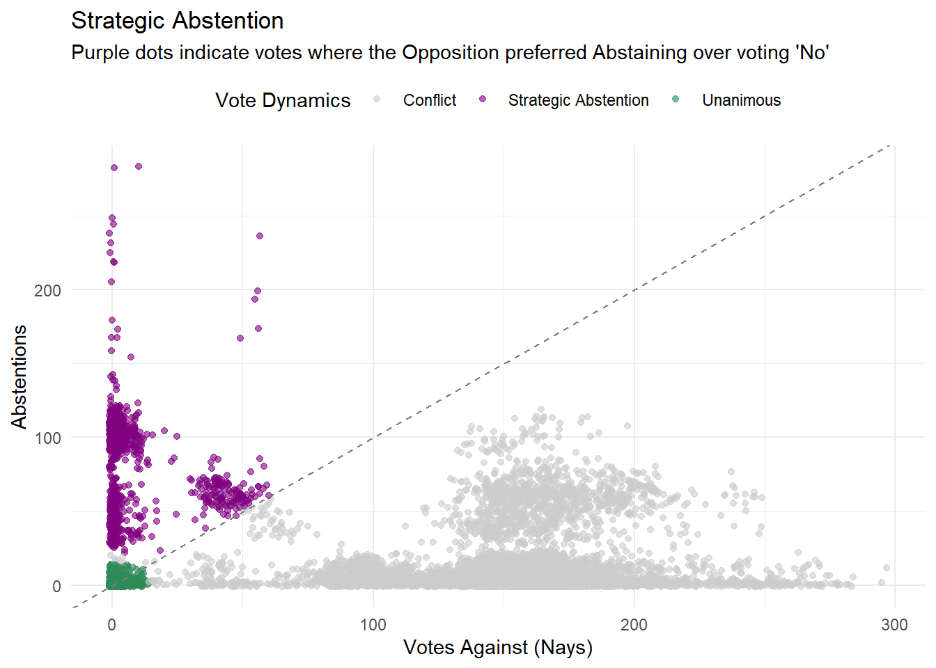
4.0.3 Strategic Abstention
When the opposition abstains together it’s a powerful political move: they are effectively not support this law, but also not stop it. This usually happens in two scenarios:
Tactical Agreements: The government accepts an opposition’s amendment in exchange for the opposition to step back instead of voting against.
Shared Responsibility: On sensitive topics (foreign policy, ethical issues), voting against might be unpopular, so they abstain instead.
The data reveals a distinct “Purple Zone”: votes where Abstentions outnumbered Nays. These are the moments where the conflict was suspended.
Code
# 1. Data Preparation: defining Voting Behaviordf_abstention <- df_votazioni |>filter(!is.na(votanti)) |>mutate(behavior =case_when(# Case A: Unanimous / Technical contrari <15& astenuti <15~"Unanimous",# Case B: Strategic Abstention (The "Purple Zone") astenuti > contrari & astenuti >20~"Strategic Abstention",# Case C: Standard ConflictTRUE~"Conflict" ) )# 2. Visualizationggplot(df_abstention, aes(x = contrari, y = astenuti, color = behavior)) +geom_jitter(alpha =0.6, width =1, height =1) +geom_abline(intercept =0, slope =1, linetype ="dashed", color ="grey50") +scale_color_manual(values =c("Conflict"="#CCCCCC", # Grey: Background noise (Normal politics)"Unanimous"="#2E8B57", # Green: Total Agreement"Strategic Abstention"="#800080"# Purple: The tactical area )) +theme_minimal() +theme(legend.position ="top") +labs(title ="Strategic Abstention", subtitle ="Purple dots indicate votes where the Opposition preferred Abstaining over voting 'No'", x ="Votes Against (Nays)", y ="Abstentions",color ="Vote Dynamics" )
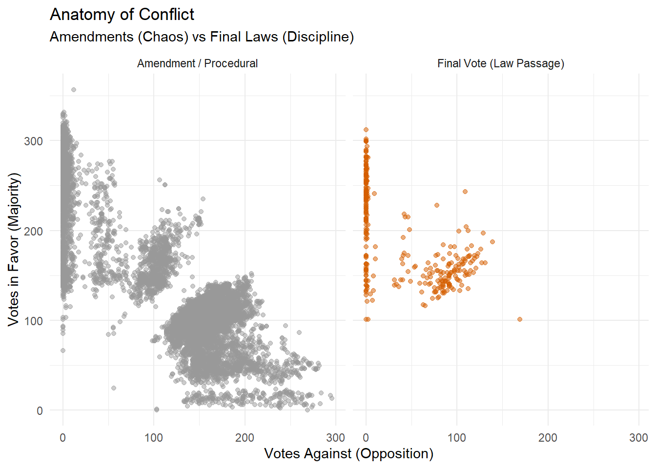
4.0.4 Final Votes vs Amendments
Legislative activity is divided into two distinct phases: the discussion of Amendments (modifications to the text) and the Final Vote (passage of the law).
The visual comparison below shows voting patterns in those two phases:
Amendments (Grey): This phase perfectly mirrors the general “Geometry of Consensus”.
Final Votes (Red): The picture changes drastically. The previous red area of rejected proposals disappears. During the final vote, the Government does not take risks. The Opposition’s attempts are already dead, and almost all laws pass. The dots condense into two specific zones:
Unanimity: Broad agreement (top-left corner).
Majority Force: The coalition lines up to push political laws through (top-center).
Code
# 1. Data Preparation: Distinguish Final Laws from Amendmentsdf_final <- df_votazioni |>filter(votanti >50) |>mutate(vote_type =ifelse(replace_na(as.numeric(votazioneFinale), 0) ==1, "Final Vote (Law Passage)", "Amendment / Procedural" ) )# 2. Visualizationggplot(df_final, aes(x = contrari, y = favorevoli, color = vote_type)) +geom_point(alpha =0.5) +facet_wrap(~ vote_type) +scale_color_manual(values =c("Amendment / Procedural"="#999999", "Final Vote (Law Passage)"="#D55E00" )) +theme_minimal() +theme(legend.position ="none") +labs(title ="Anatomy of Conflict", subtitle ="Amendments (Chaos) vs Final Laws (Discipline)", x ="Votes Against (Opposition)", y ="Votes in Favor (Majority)" )